Color adjustment for printable artwork
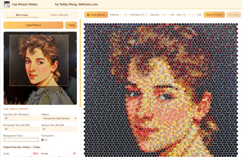
In the Online Version, you can adjust the color of cap images so the finished mosaic resembles your original photograph more closely — exactly what you want from a digital design or a printed poster.
What color adjustment is for
Real cap photos rarely match your source image perfectly. Color adjustment closes that gap for digital results: tune cap image colors — including brightness, saturation, and contrast — until the mosaic reads like the original photo.
This is the right tool when the destination is a screen or a poster: the printed cap in the artwork does not need to match a physical object on a board.
- Available in the Online Version
- Improves resemblance to the original photograph
- Designed for digital artwork and poster printing
Disabled in physical mosaic mode — on purpose
In the Standalone Version's physical mosaic mode, color adjustment is disabled. When you are going to assemble the mosaic from real caps, the preview must show the caps as they actually are. A recolored preview would mislead every placement decision you make during assembly.
Online Version — digital artwork
Color adjustment available
Goal: the best-looking printable image. Adjusting cap colors is safe because nothing physical has to match.
Standalone Version — physical mode
Color adjustment disabled
Goal: a truthful preview of real caps. What you see while planning is what you assemble.